Shine- Creative Direction
Branding
When I knew we were going to work with Shine, we knew we had to start with defining his brand properly, establishing who he was an individual with the symbols and shapes we were going to make.
Thinking of the word, “Shine”, I think of a star, or the sun, I think of radiating energy and that was the direction for the word mark. Working with our designer 7ife, it took us a lot of tries, but we got there in the end.
Cover Art
This, from the start, was going to be herculean, with the effort of trying to create and combine a whole new world in the space of three releases and have them all be thematically and aesthetically related. I worked on all the artwork and every brushtroke was done with care for Shine and this project we were making.
First sketches and samples sent to Shine and his team to land on the taste.
Final covers for Shine.
Preliminary cover.
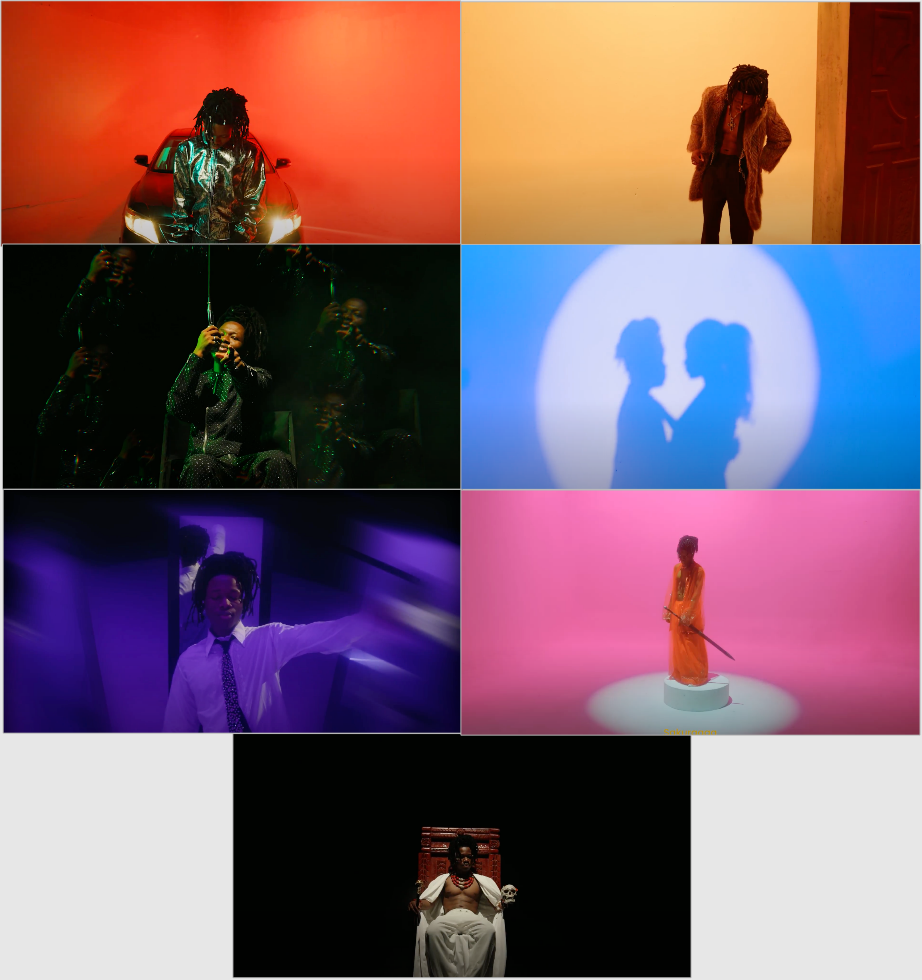
Visualisers
The visualisers for Shine were incredible but planning and shooting them took a lot out of me and the team. We had one day to film and so I had to plan out each shot and frame to make sure we made the best of what we had. They’re all available to watch here.
Credits:
Director: Anthony Azekwoh
Creative Director: @anthonyazekwoh
D.O.P: @mitchlouiz
Editor - @The_damii
Production Company: @clovacreate
Producer: @tseyomatseye
Stylist: @bubeisraell
Makeup Artist: @_.farian_
Styling Assitant & props: @vhickiey_ & @clovacreate
Female Star: @beeauty_goddess
Set Designer: @clovacreate
Gaffer: @3d_filmz_official_
Assitant Producer: @enothecitygirl
Production Assitant: @toritseju._
BTS Photographer: @dannybrownz
Gear Rental & Tech Support: @clovacreate


